
GRATUITY DEVELOPMENT PROCESS
INITIAL DEVELOPMENT
In January I had already begun the process of development through my work on the 3029 MAPA research and development module. With the work I had already done I knew the key components of my app and a simple design on Adobe XD. These key components for my app being a venue selection page with a dynamic map to show you where participating restaurants were. A shopping list system that allowed you to select both individual workers and groups of workers and tip them a variable amount. A basket system that would total and display the selection as a receipt/shopping basket of sorts. Finally, a fully-fledged payment system that would give the customer the choice between contactless and in app payments that would also send me, as the financial handler of the app, a receipt containing all of the names of the workers and groups of workers receiving a tip allowing the tip payments to be given on a weekly basis. This was to stand as my framework for the rest of my project which, when observing it in its most basic format, was carried on throughout. With the basics of my app completed, I then decided to plan and plot out exactly what I would have to achieve in order to complete this over the coming months. Although this was to massively change as I faced unforeseen circumstances throughout my development process, it was still able to give me structure within my work and a focus on what goals I would need to achieve and within a specific timeframe. On top of this plan, I had also created a physical wall of deadline dates using post-it-notes beside my desk to stand as a more casual reminder of the work I needed to complete. With a plan set and a structure for the following months I started with the development of my App using Android Studio.


ANDROID STUDIO
Within 3029 MAPA I had solely focused my research into my app development into Android studio. This was due to the fact that from my research I had found out that due to Android being owned by Google. This meant I would be able to implement certain google features into my app such as google pay and google maps which directly correlated to some of my key features. However, due to the fact that we had never used Android studio within the past 3 years of the course I knew that I would have to spend a pretty sizeable amount teaching myself how to use it. In hindsight, this decision ended up being one of the greatest mistakes I had made in the development process as I had underestimated just how difficult it would end up being trying to teach myself how to use Android studio. Throughout the end of January through part of February I had used a combination of the android developers page(Android Developers, N/A) and YouTube tutorials (Lackner, 2021) to get a greater understanding around the basics of using Android studio and some of the more specified aspects such as using the google maps SDK. On top of figuring out how to use the interface I also had to learn the new coding language in Kotlin as it primary to Android studio. All of this took up incredible amounts of time as I had to start from scratch. This isn’t to say that I had nothing to show for it however as I created some basic apps to practice my skills in Android Studio. I was also able to work with my course-mates Ellis Walker and Alex Cox in a workshop style as we had all originally planned to use Android Studio, an example of this included a basic number randomiser app (see below).


Splash screen
By the end of February, I had moved onto the creation of my app itself having felt I had gained enough prior knowledge of Android studio. However, I was mistaken in thinking this and that can be reflected in my work over the following weeks of March. I began by trying to make a dynamic splash screen for my app that would appear as the app was loading rather than just appearing on a set few seconds before the app would open. This proved incredibly difficult for me and I ended up attempting to recreate my splash screen 3 times. The main problem that I had faced was It would not allow me to set parameters for the size of my logo even when I had specified the size within the coding. This problem persisted every time and made my app look incredibly unprofessional. On top of this it would not allow me to import a PNG of my app so I had to recreate it as a vector using Adobe illustrator. After over a week of working on it the only examples I was able to produce were not of the standard I had hoped for. Although the issue was most likely a simple fix within the coding, I had very little prior knowledge of using Kotlin and so addressing these issues was increasingly difficult. Examples of some of my attempts at a splash screen can be seen below.


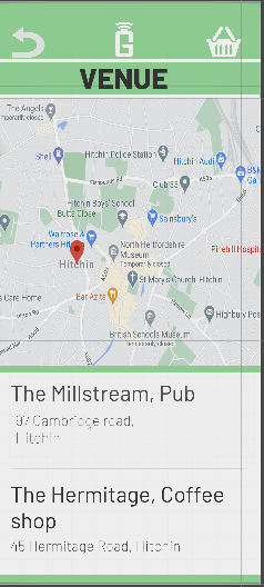
Mapping
With a barely working splash screen I had decided to move onto working on my first screen once opening the app, my venue selection screen. I needed to implement a screen that would allow users to either select from a list or a map with markers of the venue that the user would visit. At first this process seemed simple enough as I knew I would be able to implement Google maps rather easily through Android studio. To do so all I had to do was create a Google developers account so I could get my own maps API key. This would be my own unique identifier for google that would allow me to authenticate requests my for project(Google Maps Platform, 2021). With this I was able to implement google maps into my app but using the API also came with its own selection of problems. When using the maps SDK for android it only allowed the majority of the screen, apart from a footer and header for buttons, to be the physical map. This meant that a split between the map and the list as I had originally planned in my Adobe XD drafts, would be impossible. Again, there may have been a way round this, but with only being able to use google and YouTube, finding as specific a solution was incredibly difficult. Therefore, I had decided to scrap this feature and just have the map that would allow you to select your venue. I was able to get up a map of Hitchin, where my app was set using the correct longitude and latitude. However, I was unable to restrict the map to anything less than the entire world(see below). The biggest problem I found was that by using the Android maps API, it completely restricts the freedom of customisability. The biggest example of this was the restriction within its markers that I had planned to use as buttons for the different venue choices. You could create a marker and customise it with your own text and even an image although, it would not allow you to place a button within the marker itself. This meant that although I could get the marker to display information on the venue (see below), without a button to accompany it somewhere it was impossible for me to be able to easily go onto the next page. The only solutions I could find on the google developers maps page (Google Maps Developers, 2021)was to either add buttons at the header or footer of the page which looked incredibly unprofessional, or I could make the marker the button itself. The problem with making the marker the button itself was it meant all you could see would be the marker without any information about the venue. This meant that the user would have to guess the right location by the map and hope they clicked the correct venue.


Finally, a problem I had faced that cemented my distaste for Android studio was in uploading the app to my phone itself. At the time, I had not realised that creating a new project wasn’t just creating a new scene each time but an entirely new app. Looking back, it seems like a simple and obvious mistake, due to the fact that I was relying purely on the information I could find on the internet. I didn’t have that basic understanding I would’ve received if perhaps I had used Android studio over the past 3 years of university. So, simple mistakes such as this were able to slip through my work and ultimately ended up being cataclysmic to my app. As all these projects had all been made separately under different setting and parameters it became near impossible to then take all of this work and combine it into one app. So, having spent many weeks trying to find solutions to a multitude of problems whilst using Android studio I was completely stuck as to what I could do next. Android studio was proving near impossible to correlate with my app and comparing the progress I had made to the amount of time I had spent on it, I had realised that if I were to carry on using Android studio I would not have a finished prototype by our deadline.
However, after having a conversation with Alec who had decided to make a swap from Android Studio over to unity due to its familiarity and ease of use, I was debating swapping to this format as well. This was a pretty big decision as I had spent so much time on Android studio already but I decided to organise a meeting with Ashley to discuss the possibility of my app working on unity. After the meeting I realised that it would be a viable option as Unity gives you the freedom to create pretty much anything without restrictions set by SDKs and APIs. On top of this, it was an interface that I was already very familiar with using. Although only for game design in the past, it was this basic knowledge that allowed me to pick up the skills needed for app creation on unity. Around the end of March I decided to cut my losses from using android studio and switch to unity with the incredibly helpful guidance provided from Ashley’s online tutorials.
Overall, despite my struggle with android studio I was still able to learn many things from using this software. This basic understanding of the software that I had now learnt would allow me to explore using Android studio in the future when I am not so time restricted. Most importantly, I feel that I had learnt a great deal from getting caught up on using Android studio. Sometimes things do not go to plan especially when dealing with as great a project as this. From this I realised that getting hung up on trying to stick to a plan meticulously can often lead to even more damage to my project. By being more flexible with the software I used I was able to then create the same app I had intended just with a more familiar software. This journey of flexibility is something I will carry on throughout my project and future projects that might require change.
UNITY
The next stages of my development were carried out with the assistance of Ashley Brown and his incredibly insightful knowledge on using Unity within app creation. After carrying out a meeting with Ashely to figure out how viable it would be to create my app in unity and getting the green light to go ahead, a meeting was organised for the week after. It was then up to me to create the layout for my app so that Ashley and I would be able to the work on writing the scripts. This would provide me with the skeleton for my app including all the buttons on the correct pages and layout so I would then be able to focus on the coding with Ashley.
To achieve this, I started with Ashley’s tutorials that he had posted onto Aula. These tutorials covered the basics of app creation with unity, with the first few videos, including setting changes to be able to create an app on unity which is usually associated with games. I was able to explore setting a screen size for my personal phone and changing the build settings to suit Android . Once these settings had been created, I watched the remainder of Ashley’s videos to get a better idea on UI design.

Skeleton app
Once I had gotten a better idea on how to traverse the building of an interface, I was able to take advantage of my current living situation by organising a workshop for me, Alex and Ellis to carry out. This allowed us to teach each other what we had all learnt in creating an interface on unity. From this point, the creation of a simple interface was very easy. I was able to go off on my own and spend a couple days creating the basis of my app which can be seen below.
As seen, I have created 6 screens that I plan on using for my app. These include the venue selection page, with buttons to select a venue which features a map in the top half of the screen. The next page is the staff selection page that features a list of staff members and variable text boxes next to their names to allow the user to type in a desired amount. There is also a gap to put a tip calculator into. The basket page is a basic empty basket page with a gap to make a receipt appear. The next page is payment selection, with buttons to allow you to select the next pages and a button for an opportunity to make a donation. Then the final 2 pages being the payment that have also been left blank as to leave space for a webpage so in app payments can be made. This is a very simplistic outline but gives me the structure to be able to work on the scripts with Ashley.


THE C# SCRIPTS
The c# scripts contained within my app is what allowed me to make all of the key functions of my app actually work. Thanks to the help of Ashley’s 1 to 1 sessions, I was able to complete the scripts I needed to accomplish all of my intended functions. I will then go through the scripts we created over the next 2-3 meetings with Ashely over the span of the next fortnight. Explaining what exactly the script is, any problems faced while trying to create my intended functions and how it works in context to my app
LoadScene.cs
The load scene was probably the easiest scripting and one of the most essential parts of coding, as without the load scene, it would be impossible to open any other pages of my app. By using the scene manager on line 17 with the load scene class, it allows me to change to whatever scene I had created. I am then able to apply this script to any other button as long as I had typed the loadscene correctly. This was the only issue I had faced whilst using the Loadscene script as when applying it to a game object in unity you then had to make sure you had spelt the Next scene exactly the same as the name of the next scene you wished to upload. Although a very simple mistake, it had happened to me multiple times which made my app unusable. So, by spelling the Next scene text box correctly I was able to load the other pages of my app.


SaveAmounts.cs
The next part of the script that I had worked on was my save amounts script. The aim of this was to allow me to be able to save the users input of a tip for all of the different variable text boxes. All of these amounts had to be saved into the coding so that I would be able to use this saved information later on in my app in sections such as the basket and the email sender. To do so, i first had to create a public game object for each separate worker and section beginning on line 8. Then, from line 17, I would set each of my game objects as a string being 0.00. This was to ensure that the input from the user would be read as a string because Unity’s UI automatically makes all variable inputs text. Having the input being read as a text instead of a string would not allow for a totalling of the numbers (seen in total script). By making the text input a string this simple fix allowed for my TotalCalculator script to function correctly as you shall see. Line 29-35 set the amounts of all of my game objects to whatever the user inputted. As long as it was a number it would allow for all the totals to be displayed on the receipt in the basket page.

TotalCalculator.cs
The next part of my coding works in conjunction with the saveamouts script as an extension to be able to calculate and total the amount of tips the user would want to give. To do so, the string must be gotten from the saveamounts. As I had already created the objects all I had to do was GetString from each game object as can be seen in line 17-23. The next step was to have each name appear on the receipt with the variable amounts appearing next to each name. This was done by creating each object as a parse to allow for the variable amount to be broken down and used within the total. The final step of this script was then to ensure that all of these amounts would total into the totals box below. Having made them into strings, it was just a matter of totalling the variable inputs from the user. As you can see from line 118-127, this was done by setting an empty string that would be able to accept the other strings. Once these had all been added together in the empty string it was just a question of making sure it was displayed in the totals box. Although simple enough, the greatest challenge faced was not having the User input set as a string. This is because no matter what coding we had tried it refused to add together text. This is the exact kind of small scale problem that can clip through the scripting and will occupy time for many hours in order to find a solution. With this in mind, myself and Ashley went away to think about the challenge before fixing it. Once this was fixed, I was able to have a fully operational basket page that would produce a receipt of what the user has spent and a total at the bottom of all these variable amounts.


AddPound.cs
The next script that I had to write was my addpound script. The function of this was to allow the user to be able to add a £1 donation using a button on the payment selection page, once they had decided who they had wanted to tip. The difficulty behind this was making sure it would add to the total amount after the user had made their selection. To do this I had to create a class called addtip which would add a pound to the temptotal that I had already created in previous scripts. By adding in the Apptotal string before the first frame update it allowed me to then add a pound to the variable total created. To make sure the user had an opportunity to donate a pound all I had to do was implement this script into a button after the total had been selected. This way, it would allow the user to simply add onto the total. Originally, I had planned to have a rounding up button to the closest pound but the coding proved too difficult. Also by setting the donation as just a pound means it’s more likely to be used as this is not a huge amount. Finally, there was a slight glitch with my button that I was unable to fix. This being that if you were to go back to the basket it refreshes the button. However, I decided to keep this glitch in because all it means is that the user would then have an opportunity to donate another pound which isn’t a bad thing. You can also clearly see the total amount spent gaining a pound as well so there would not be confusion in the pound not being added due to the button reappearing.

EmailSender.cs
The email sender scripting proved the most difficult hurdle to overcome for my whole app due to the time spent having to fins the right solution. The email sender script was implemented so that an email would be sent to my account from the app containing a copy of the receipt created by the user for how much they would like to tip. The first problem I first experienced was not to do with the script itself but rather the way I had tried to implement an email sender. I had originally tried using a free asset off of the asset store (Carlos, 2016). The free asset allows the user to send an email to another email of their choice with whatever text they’d like. I thought that by setting the input boxes for the email addresses to only send from one email to another and then by changing the assets script to make sure the email text box would accept the variable Totalvalue I had set previously in my TotalCalculator script. Then, by hiding all of the button apart from the send button I thought this would then send me the email containing the receipt once the user had clicked it. However, this appeared to not work. Even with Ashley’s help and attempts at making it work it still proved impossible. Something that I have learnt throughout creating this app is when using external sources such as assets from the asset store, not only will you probably not be able to find the exact solution you are looking for but it also becomes incredibly difficult to adapt these assets to suit your needs as you were not the one that made it. This is why I am so grateful to have Ashely for these tutorials as he is able to show me personalised solutions for my app. Knowing all of this, I decided to scrap the asset I had tried to make and knew I would need to create the script with the assistance of Ashley.
After a short break to come up with a solution, we were then able to start looking into creating our own script. To do so, I had to fill in a sender and a receiver email so the emails would arrive at the correct destination. Then by setting an SendEmail class with the correct smtp setup such as a 587 smtp port (this is the default standard for sending emails), I had an email system setup as seen between lines 36-41. Now I just needed to make sure that the email sent the receipt. To do so I just had to retrieve the variable data from the Gameobjects I had already created and compile them onto a list with each name on it. This also included the pound so I could see on the receipt if there was a pound donation added. This collectively could then be linked to the payment options so when clicked, I would receive an email with all the relevant data. However, one more hitch was then found in that the emails still were not sending which was not due to the coding. This became apparent after a conversation with Cameron who was also using an email sender in his app. The problem was that Googles privacy settings do not allow you to send emails from an external host. Once I had found this out however I was able to turn off all privacy settings which allowed for emails to send and be seen.


WebViewer.Cs
For web viewer script I had used an external source thanks to GitHub (Nakamaru, 2021). This proved useful as I was able to transfer the assets package straight into my app. However, as I had mentioned before, it often becomes difficult to be able to use an external package as it doesn’t always suit your exact needs. Ashely pointed out how ‘unorganised’ the coding actually was so it became difficult trying to adapt it. There were originally problems with the sizing of the webviewer page which I was able to fix through trial and error. I now had to change the margins set on line 118 and try different sizes until I had found a size to fit onto my app. Another problem faced was that the Webviewer seems to break the rest of the buttons on the page not allowing you to go back. However, as you can see the code is near impossible to read and so I had decided to just leave it as is due to the fact that the user is on the last page anyway so would not necessarily need to go back. Then all I had to do was copy and paste my Paypal.me link into the URL box on unity and I had an in-app payment system set up using PayPal through the internet.
With that I had created all of the scripting to make all of the functions on my app work. Although proving one of the most difficult and frustrating parts of the app development, my skills have been improved thanks to the help of Ashely. I have also been able to achieve everything I wanted to achieve in my app through this scripting.


UI DESIGN AND LAYOUT
With the skeleton of my app completed and the coding finished the next step was to make sure that I had a suitable and well-structured layout for my app. To do so I had organised my last meeting with Darren to be able to go through some specific design features. In this meeting we discussed general design, colour and font. Working with Darren enabled me to create a design for my first map page using these three factors and I then was able to use this design that we had created as inspiration for the rest of my interface design. We also worked on a design idea together using Illustrator during this meeting (below) which ended up being the inspiration for my specific UI style.

General design
The General design was the easiest decision I had to make as I had already sorted out the majority of the layout. However, there was a couple of things that I did need to improve on. For example, in my design I had simply created buttons to host the scripting I had created but when looking at other interface designs you can clearly see that buttons with text on them are not commonplace so I needed to swap these out with something else. I decided that I wanted the majority of my buttons to then be a mixture of icons and text (Gadd, 2019). An example of my text buttons would be on my venue selection page. Rather than having buttons next to the venue text I made the venue text the buttons themselves. Not only does it look a lot better stylistically but it also makes the buttons feel more natural as it is very common to assume that text such as this would be an app on a phone. Looking at apps such as Wetherspoons for inspiration clicking the text as a button makes the app feel more functional. I had also decided to use icons for actions such as going back a page or clicking onto a basket to continue the look of professionalism. I also wanted to focus on negative spaces (Tubik, 2018). Not just white space but also negative space as “terms are fully interchangeable.”(tubik 2018). With this said due to my colour pallet my negative space was the use of empty white and green space. Having this negative space makes my interface look much sleeker as it isn’t so overcrowded. This can be seen on my contactless page where I tried using negative space against the logo to make it stand out. Finally, the extra photos that I was not able to source myself due to Covid restrictions were provided by the free website Pexels.

Font
With Unity only having a very basic selection of fonts to choose from I knew that I would have to import my own fonts. Selecting a font was made a lot easier with the use of Google fonts and its display system. I knew that I wanted a modern style font that was simplistic yet sleek looking. In the end, I decided to choose Barlow (Tribby, 2018) as it suited my needs of having a sleek and simple style. Simple blocked font without any emphasis on any letters makes it look modern and is easily readable. I also chose Barlow as it had over 18 styles within its one font. This allowed me to have lots of flexibility when it came too choosing different font styles for headings, sub headings and text boxes.

Colour
The final step of perfecting my layout was to look at colour. I knew I wanted my app to be a pastel green as to reflect the gentle connotations behind the giving of money that my app stands for, but I had not really given it much further thought. After my meeting with Darren, I knew that I needed to create a bigger range of swatches rather than just saying green. The first change I made to my colours under Darren’s advice was to not use true black or white as it will look unnatural on the app. This is why all of my light and dark aspects are slightly pastel shades of white and black making it easier on the eye rather than having a clashing monochrome aesthetic. He also suggested I used Adobe colours to get inspiration for my colours which was an incredibly useful tool for my colour selection. It allowed me to use key words such as ‘money’ or ‘giving’ to suggest different colours and this is how I had selected my main green. I had also realised that I needed more variation in my app but I didn’t want more colour. This is why I was then able to, from my primary green, create a monochromatic scheme (Babich, 2017) of a selection of a few different shades that make the app look clean and elegant.

USER TESTING
Once I had received my user testing I realised there was a couple of small hitches that needed to be fixed. After asking for Feedback from Darren, he had a couple of similar points of improvement. The main one being moving everything away from the exact borders of the canvas as it looked unnatural having texts and buttons so close to the edge of the phone. Additionally, an issue found with user testing saw the header being cut off due to widgets having not originally being taken into consideration. A couple other small jobs were also done such as removing some of the photos from the Staff screen and adding an amnesty button.


WEBSITE DEVELOPMENT
After my last meeting with Darren we had a discussion on the possibility of me using the website Wix to create my website. As long as the skills were shown within creating the app i was told that i would be able to use a website creator such as Wix. This was incredibly helpful to me as i had come under quite a time constraint due to the development of my app .So, by being able to produce professional websites without having to write the coding meant i was able to complete my project in time. This meant i was able to complete 3 professional websites for my final project, My development and a customer website.
Wix is incredibly easy to use as it gives you thousands of options when it comes to creating different sections on a webpage. A simple to follow interface gave me the freedom to display my work as i had planned using HTML within a much smaller time frame.
The photos i used on my website were either taken by myself or taken from the website Pexels.
REFERENCES
Android developers (N/A) Meet Android Studio [online] available from <https://developer.android.com/studio/intro> []
Babich, N. (2017) The Underestimated Power of Color in Mobile App Design [online] available from <https://www.smashingmagazine.com/2017/01/underestimated-power-color-mobile-app-design/> []
Carlos, L. (2016) Simple Email Sender [online] available from <https://assetstore.unity.com/packages/tools/integration/simple-email-sender-71483> []
Gadd, T. (2019) UI Cheat Sheet: Buttons [online] available from <https://uxdesign.cc/ui-cheat-sheets-buttons-7329ed9d6112> []
Google Maps Developers (2021) Markers [online] available from <https://developers.google.com/maps/documentation/android-sdk/marker> []
Google maps Platform (2021) Using API Keys [online] available from <https://developers.google.com/maps/documentation/android-sdk/get-api-key> []
Lackner Phillip (2021) Phillip Lackner Youtube Page [online] available from <https://www.youtube.com/channel/UCKNTZMRHPLXfqlbdOI7mCkg> []
Nakamaru, K. (13/04/21) Unity-Webview [online] available from <https://github.com/gree/unity-webview> []
Tribby, J. (2018) Barlow [online] available from <https://fonts.google.com/specimen/Barlow?query=Jeremy+Tribby#about> []
Tubik (2018) Negative Space in UI Design: Tips and Best Practices [online] available from <https://uxplanet.org/negative-space-in-ui-design-tips-and-best-practices-98311cb2ad16> []